To structure a startup website that converts visitors into users, and users into customers, startups need a variety of elements working together to get attention, build interest, desire, and drive action. This post will show you what you need to achieve this and the reasons behind the choices that are being made.
Here’s quick overview of this article which:
- Provides you with information about a startup website’s goals, what to do, and what not to do
- Gives you startup website design tips
- Explains startup website structure for homepage
- Provides information on additional pages which should be linked to the top menu
- Shows you what should be in the footer menu
- Talks about what you can do with sidebars
- Shows what additional services which you can use to run your website
1) The Goal of Your Startup’s Website
The goal for your site should be to inform your visitors about your product or service, provide value to them if they’re your target customer, convert them into subscribers, free-trial or freemium users, or customers, and meanwhile minimizing barriers to entry.
You’ll want a combination of good UX/UI design, good copy with an overarching narrative that matches the outcomes the potential customer will experience, and matches the intent of the target customer.
A) Amount of Content
You want to gain and maintain visitors’ interest by minimizing the amount of text for your visitor to read on your home page by driving in your core messages in each section as simply as possible.
Of course, you’re going to have several sections on your home page to describe your startup, but that content should be concise, short, and to the point with no bullshit.
That’s because everyone scans website pages before they actually read them.
And you need to catch their attention before they leave, because the average user has an attention span of eight seconds.
A good short intro video above the fold would be a great way to capture that attention. Another way would be with a captivating unique value proposition with an exciting image of your product.
If you get their interest and it looks like they won’t have to spend an hour to read about your startup and how it can help them, then they might spend 5 to 10 minutes reading through it.
And if they like what you have to say, they’ll probably subscribe and/or come back to your website to check out more info about your startup.
B) Create Value to Your Users By:
- Showing them specifically what they have to gain by using your product or service which could be via
- Technology you offer
- Some sort of niche community they can get access to and feel belonging within
- Coaching or professional services
- Providing content that’s relevant and useful to them
- Can be through your blog
- Can be informational on other pages of your website
- Or via an awesome free e-book, list, or something similar through a lead magnet
But there’s more than just value creation because there are a lot of ways we can slow our startup’s progress without the right guidance.
C) Website Funnel Optimization for Leads, Free Trials, or Sales
On a startup website, the site should ideally have several touchpoints that will either direct users to sign up to an email list and/or free trial or to make a purchase.
1A) Lead Acquisition
Using lead generation software for popups, overlays, banners, scroll bars, click triggers, content upgrades, push notifications, contests, and referral programs can help you with your lead generation efforts.
Most of the time, lead generation software is used for websites selling a product or service. It can be a SaaS startup but it doesn’t have to be.
When lead acquisition is the goal, it’s important to not have a million popups on a visitor’s screen at once. They will leave your website almost immediately if that occurs. Startups have to time them right if they’re going to be effective, and A/B testing the timing will help you with that, as well.
They’ve got to have good placements around your site and they have to offer killer value to the visitor so that they have lots of incentive to sign up to your email list.
2A) Free Trials
Free trials are often used for SaaS (software as a service) startups, but can be for other types of startups as well. They’re used to introduce the user to the product or service and hopefully “hook” them into staying on board and purchasing the product/service.
There should be several touchpoints for website visitors to sign up for a startup’s free trial throughout the website. Usually with a call to action (CTA) on the hero image, a CTA on the bottom of your home page, sometimes one in the middle of the homepage, and on other pages where it’s appropriate.
For instance, for StartupDevKit, we have quite a few different areas for both desktop and mobile websites which direct users who are interested in trying a free trial to our growing incubator program. We have two placements on our home page (one on the hero image and one on the bottom before the blog), a CTA and button at the bottom of our how it works page, a CTA on our widget sidebar to try the trial, in our emails, and several other places.
Our goal is to offer a free trial first so they see the value of our new type of incubator program and how it can help early-stage startups, agencies, and other similar organizations. By the end of the free trial, our goal is to convert them into paid members so that they can continue their growth with the resources, feedback, and mentoring that they had been receiving.
3A) Sales (E-Commerce)
However, if you’re an e-commerce startup, you’re going to have a different immediate goal: sales.
So you’ll want to have a different layout on your homepage that showcases the different products you’re offering, special sales on products, new arrivals, best sellers, clearance items even, and lead magnets offering discounts on your products when they signup to your email list.
You may want to have a sidebar as well so when people go to different pages, you can have other information and offers there for your visitors.
Account Creation to Purchase E-Commerce Goods
Have you thought about your experience purchasing items from an e-commerce store?
What about requiring the user to create an account to buy that item?
You may have not wanted to do that. And that very thing can decrease your purchases and increase cart abandonment by creating friction during the signup process. That makes it a barrier to entry.
Instead, you can include guest checkouts and/or allow users to sign in via one of their social media accounts which would automatically create an account for them. This will decrease barriers to entry.
So make sure that you understand the exact process that users have to go through to sign up for your product or service and then once you know all of the steps, see what you can eliminate and what you can optimize to reduce the friction a user experiences.
In the next section you’ll see what can hinder your subscriber and customer conversions and what to do instead so you can create a better experience for your startup’s user and grow more because of it.
4A) Barriers to Entry on Startup Websites that Prevent Signups by Visitors
What is a Barrier to Entry?
A barrier to entry is anything that makes the signup process, purchasing process, or desired action more difficult to achieve or less desirable for them to do.
Below are examples of barriers to entry.
Long Signup Forms
Long signup forms that require a significant amount of information can make people feel uneasy.
This is even more true these days with all of the privacy concerns in our society using our data.
An example of this is asking for an address and a telephone number. Nobody wants another spam phone call, especially with private cell numbers that might be used.
And, it takes more time to fill out long forms. Think about required fields. Do people always want to give their last name? The answer is usually no.
Most people are okay with providing their first name and email address.
But when you add required fields for a phone number, business name, and/or website URL into the mix, then you will likely see a drop in signups for fear of being marketed to when your visitors are still in the consideration stage of the buyer’s journey and just checking things out.
So the shorter the form, the more likely you are to get a signup or a purchase. It’s simple.
The simpler the process for your startup website’s visitors, the better the experience.
Devil’s Advocate Position on Long Signup Forms
HubSpot is a brilliant SaaS marketing and education company, but they ask for all of the aforementioned information. So there must be some validity to it, but perhaps it’s valid more so for an already established company that people know and trust than a new startup.
Back to Our Philosophy
But the “weeding out” philosophy isn’t not entirely true.
That’s because there’s likely a competitor out there who doesn’t require all such an upfront commitment and the visitor can wind up going to them, especially if they’re looking to buy something immediately.
If someone does fill out the form, they may just want to know how it works and aren’t ready to purchase.
Additionally, they could even be a no show for the appointment you make by accident or on purpose. Then, that person gets hounded by phone and email to talk with a representative.
And alternatively, they could lose interest after the demo. And once again, they get hounded by representatives.
Scheduling demos to see how your software or product works seems desperate to me.
I’ve found that there are so many better ways to get leads and you can have your own qualifying process to determine where they are in their customer journey and your sales funnel.
Really – don’t be desperate like that as a fresh new startup.
No Peace of Mind for the Potential Buyer
People who are interested in buying something from your startup would like peace of mind that their purchase will be the right decision.
12 other barriers to entry for let’s say, a membership to a startup’s SaaS are:
- Having no free trial
- Requiring a credit card for the free trial
- No money-back guarantee
- Having no testimonials
- Limited information on what they’re buying
- Too much information in a hard-to-digest format
- A crappy-looking website
- Bugs during a free trial
- No customer service
- No sales support
- Limited or no product reviews
- No pricing on the different membership levels requiring users to inquire about pricing
Making Users Schedule Demos
Another thing I firmly believe you don’t want to do is make visitors wait to learn about your startup’s product or service via a demo.
For instance, making people schedule demos to learn more about your product/service increases the barrier to entry and will often prevent visitors from signing up for the demo.
And, it may very well make people leave your website without ever returning.
This is because scheduling a demo means people committing their time and information to something they may have little to no immediate interest in buying. They might just be curious.
Moreover, a lot of those forms require you to put in additional information, such as a phone number, company size, and the name and title of the person filling out the form.
Some of the thought behind scheduling demos is that it might “weed out” people who aren’t really interested and only those who are will fill out the form. And, the sales rep gets to try and develop a human connection once they do the demo.
What to do Instead of Scheduling Demos
Instead of making users schedule demos, there are a few things you can do to reduce barriers to entry and give them more info about your startup.
- Post a video about your startup
- Explain it with text and images on your site in a pleasant format
- Create a free trial with no credit card required. And while doing so, minimize the amount of form fields visitors need to fill out.
- Just make sure that your free trial includes lots of tips on how to use it and your onboarding emails share easy-to-understand information about your startup’s product/service.
- Make enticing lead magnets that incentivize visitors to sign up to your email list while providing them with some high-quality content in return. Just require a first name and email field.
- Then, in your automated welcome email, you can also share more information about your startup and the product/service you provide.
2) Startup Website Design Tips
When you’re developing your website, design your front page with hyperlinked page jumps from each section (or widget) to go to their respective labels on your menu.
You also want to design your site in a way that it’s visually appealing. So no tiny text! 14pt text is the minimum size for paragraph text.
Using nice icons, graphic art, and/or quality images is so important.
In fact, it’s quite necessary to use images with your text-based content because it greatly enhances your ability to keep your website’s visitors engaged.
Why? Because your first impression is paramount to your target customer.
What’s more, your startup website needs to have a great UX/UI (user experience/user interface). It’s crucial towards your startup reaching product-market fit.
Suggested Reading: Hundreds of examples of one page web designs for new startups by ONE PAGE LOVE
The suggested reading above highlights literally hundreds of startup website examples and will get your creative juices flowing.
You’ll see how much of a role design plays into the experience of the website.
The same goes with smartphone apps, as described in this article about smartphone UX/UI app design.
In addition, don’t write huge chunks of text in each section because visitors will be less likely to read it.
Instead, write smaller, bite-sized content that’s easily digestible. Space it out between multiple sections.
You’ll find that it positively adds to the overall feel of the website when you structure your content this way.
Optimize for Mobile Viewing
 Approximately 50% of web traffic is viewed through a mobile device now. This statistic screams how important it is to make sure your site is optimized for mobile viewing.
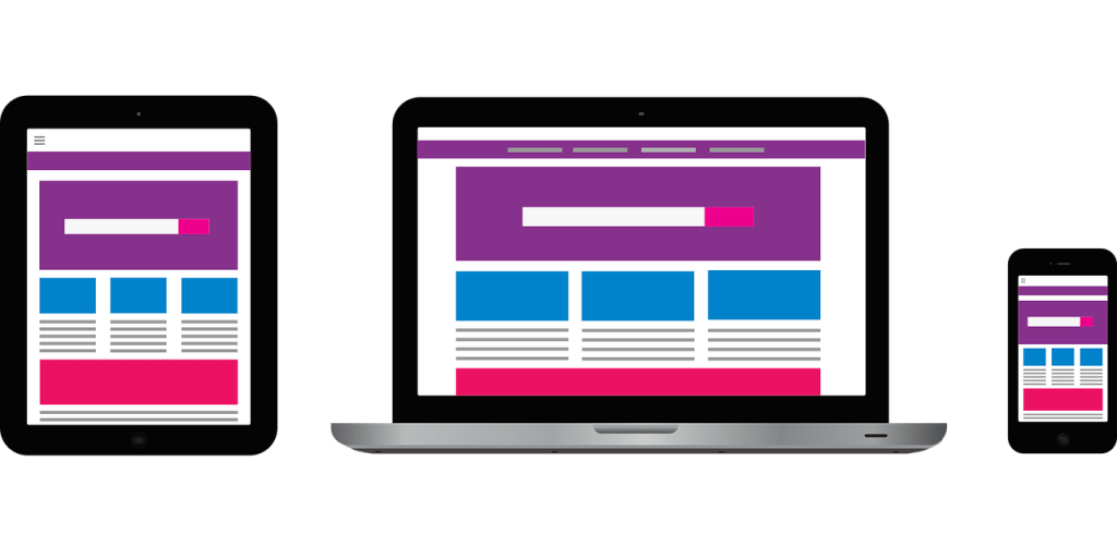
In order to make it optimized for mobile use, it has to have a responsive design.
Meaning, the elements on your website will shift based on the screen size and device it’s being viewed on.
There are three types of devices used: desktops, tablets, and smartphones.
With most WordPress themes, you’ll see an option to view how your site will look using the three types of devices through your customize section.
A site that’s not responsive is static, which means its elements don’t shift at all based on the device used.
You’ve probably seen this type of site on your mobile device before, where you have to zoom in and scroll around just to read it. Static sites are quite behind the curve.
So make sure your startup website is responsive and optimized for viewing on all devices!
In addition, one thing that may help you, especially if you’re using a WordPress website, is optimizing for mobile viewing via the Accelerated Mobile Pages plugin. Essentially, it makes your website faster for your mobile visitors. Moreover, this can lower your mobile bounce rate because of the decrease in loading time.
3) Startup Website Structure – Homepage
This is a basic template of front page architecture in what to include in order of how a visitor should see it.
Disclaimer: Every startup is unique, though, so you may need to add in other sections that help the user better understand your startup and how it will benefit them.
1) Hero Image / Above the Fold Image
The image here should not have text pre-written on it via any photo editor. It should be text via HTML and stylized with CSS.
1. Tagline
Your tagline should be strongly, broadly, and shortly worded which shows the benefits your target users will get.
2. Description
Create a description that’s a bit more in-depth than your tagline that shows how you’re solving a problem for your target market.
A video between 30 – 60 seconds can take place of a description.
Videos are much more engaging than text and are more likely to be played than not played.
If you can fit in enough copy to speak about how it works, then that’s even better! If not, save that for a few sections later.
3. Call to action
Create a call to action with an incentive that encourages them to either sign up:
- To your email list in return for a great piece of content that will be helpful for them.
- By joining your platform for free perks they couldn’t otherwise get.
- To your platform to get a free trial, which could be physical goods or digital goods.
Any one of these options will suffice, but the second and third options are better because it’s a more direct path to those visitors signing up to buy your product or service.
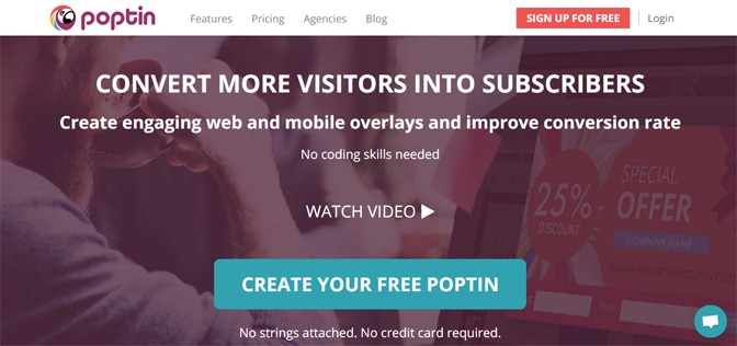
Let’s look at Poptin, a SaaS company that helps you convert visitors into leads and customers through many different types of popups and software to help you get better conversions.
You can see by the above picture that they have a commanding headline/tagline, a descriptive sub-headline/description, an option to watch a video, a call to action, and even text to make your decision to try their software even easier by reducing credit card barriers.
2) How it Works
When creating this section, include clean and vivid graphic art or real life images paired with text that clearly explains how your product or service works.
Feel free to use multiple widgets to get your message across, but three widgets is usually the max you would want to have, catering to short attention spans and easy readability.
The famous phrase, “less is more” comes to mind. Meaning, less text can mean more authority. You shouldn’t be trying to shove your product down people’s throats.
If they’re there because they’re interested, then the product/service features should do a lot of the talking.
However, at the same time, you should consider how your product/service is different than the competition. You can word it in a way highlights what you can do better.
3) Testimonials (For Social Proof)
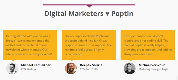
You should ideally be posting three testimonials with a picture of the individuals giving them and a link to their company or organization from which they belong. Having testimonials provides social proof that what you’re offering, works.
Again, below is a perfect example of testimonials from Poptin.
Suggested reading: 5 Best Practices for Testimonials that Lead to Increased Conversions by TechWyse
You may include testimonials in your main navigation with an HTML jump link to the section on your front page, but you don’t have to. However, do realize that when you include it in your nav bar, it’s more easily visible and thus more likely to be clicked.
6. Partners or Clients, if any (Further Displaying Social Proof)
Social proof is a powerful thing and this section continues to add to it. Big clients that are well known could be added to this section. Look at this example below of CrazyEgg.
Having partners displays social proof as well. It shows that other organizations trust you and your brand. They wouldn’t really be okay with you adding their logo on to your website, otherwise.
7. Press
When you have a press section on your homepage with three or more mentions, testimonials, and partners, you will be oozing with social proof. This is a pretty simple section, too.
All you have to do is have the headline of this section as: “As Featured In” and then include the logos of the press outlets that covered your startup.
Some companies link to the articles from the logos themselves and some do not. It’s a matter of personal preference.
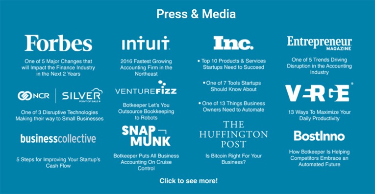
This startup named botkeeper, which is one of our partners, has a press section that does something similar.
Check out the screenshot of their press section below.
4) Additional Pages Linked to the Top Menu
1. Home
Have a link on your menu for your home page. It’s basic but necessary.
2. About Us
An about is page is a great way to tell your story in a human way and show how your brand connects with your customers.
Suggested Reading: 10 About Us Page Examples That Are Probably Better Than Yours by HubSpot
3. Features
Have a features page that goes in depth about what your offerings are. While laying out your features, add multiple calls to action for them to buy, sending them to your pricing or checkout page.
4. Pricing
Highlight your top plan or product and include variations between monthly and yearly plans if you offer a service. You may want to include comparisons vs competition in your pricing page too.
5. Frequently Asked Questions (FAQ)
Write a FAQ page. It’s a great opportunity to answer any questions people have had about your offering.
You can write questions that you anticipate people asking, as well. To do this, you try putting yourself in a visitor’s shoes and think up questions. You can also have some friends review your site and critique it to find holes and provide questions.
What’s more, you can use the FAQ as an opportunity to answer any objections to using your product or service that someone might think of and say.
6. Blog
Having a blog is both a great thing to have and also a great responsibility.
It’s great because you can provide content that your target audience will love.
However, it’s a big responsibility because you have to write great posts to keep readers engaged on your post. Writing a high quality blog post also takes a lot of time, which includes doing keyword research before you even start writing.
Moreover, it’s a big responsibility because it’s up to you to market each post so it gets the attention it deserves.
If it’s written and optimized for SEO properly, it can potentially drive a lot of traffic to your website from search engines and social shares. Check out this SEO checklist with over 100 ways to improve your rankings on search engines for your website and increase your traffic.
What’s more, if you do have a blog, make sure that you have some social media sharing software enabled on your website so people can share your site and the posts they read.
7. Subscribe
Include a subscribe page so people can always find where to sign up to your email list if they’re interested. Email remains the highest converting marketing channel. Using a lead magnet as an incentive within the subscribe page will increase your odds a signup too.
8. Login/Signup
Login and signup sections should be created and accessible on the top left or top right if you have a platform. A vast majority of them are on the top right hand side.
Some sites have this section as a static part of their website that isn’t part of the menu. You can do that if you like, but it’s possible that it might get less visibility when used on mobile devices due to the responsive build of the website.
5) Footer Menu
Put a menu in the footer of your site to optimize navigation to other pages and the pages linked to the top menu. It’s annoying to scroll all the way back up just to go back to the top menu.
This is where you include pages on the lower menu that you wouldn’t normally include on the top menu.
1. Customer Service
Make sure you have a customer service page to assist your existing or potential customers. It goes a long way. Many people also have this page labeled as “Support.” This is personal preference.
2. Press
Include a press page for press inquiries. It’s advisable to include a press kit with high resolution images of founders and logos. This is important for members of the press that want to cover your startup. And it’s especially important if you have ad space that you sell.
In addition, you might want to include what publications or media shows you were featured in which were listed on your home page.
3. Contact Us
This page is important to have. This is an avenue for potential customers to contact you if they have more questions. It can also lead to exciting business partnerships. Yes, you will get people pitching their services for you, but any business will get that. Make sure you add captcha verification on your form to prevent bots from spamming you.
4. Team
Include a team page to add a human connection and build trust (if you include a summary with each member’s experience) to your brand/product/service. It’s not necessary but it can be helpful.
5. Social Media
Social media profile links should be clear, ideally colorful, and visible in the footer of your website. Contrary to these being in the “footer menu” section, they will not be part of the menu, but rather a part of the footer section. Remember that the links should always open in new tabs.
6) Sidebars
Sidebars are good in certain circumstances and there are many uses for them, depending on what page they’re located on.
They can be used to incentivize signups through different additional lead magnets.
You can use them to put a quick signup form on there.
You can promote your social media accounts on them through the use of social media widgets.
The sidebar could have additional calls to action.
Your sidebar could feature additional menus or even other relevant widgets to your product/service.
However, most startup websites do not feature a sidebar as it takes away from the flow of the design and distracts the visitor from the sections you want them to browse through.
7) Additional Services to Use
Conversion Optimization Software
Poptin (Best value) – Poptin has a fantastic free version that gives you an incredible amount of popup variations and conversion rate optimization tools to help you get leads. Their next plan starts at $19/mo and you can save 20% if you buy yearly. Their pricing model is based on the amount of views your site gets monthly. They have a boatload of features and highly suggest checking them out.
Sumo – Sumo has great conversion optimization software and tons of bells and whistles to go with it. It has a good free version that’s not limited by traffic, but rather limited by features and the amount of subscribers you have (500). They have quite a lot more features as you buy the larger plans and no paid plan has any limits on subscribers or traffic.
You can mix and match between Sumo and Poptin’s free features to give yourself quite a nice suite of features if you’re a bootstrapped startup.
OptinMonster – OptinMonster is conversion optimization software that, like the above services, has many variations of popups and customization features for them. They have no free plan, however they have a 14-day money back guarantee.
Live Chat
Tawk.to – Tawk.to is a free messaging app that lets you monitor and chat with visitors on your website, mobile app or from a free customizable page.
Drift – Drift’s free personal version allows you to chat with prospects, giving you the flexibility to talk with them from a dedicated support thread on your Slack channel. You can also schedule meetings and send sales email sequences with its free version.
Analytics & Feedback
Google Analytics – Awesome free analytics for your website. Through Google Analytics, there are a litany of different ways to uncover data about your visitors’ behavior, demographics of visitors on your website, as well as see what parts of your website are performing better or worse than others.
Their free version is quite vast. Everyone should have Google Analytics installed – it’s a no-brainer. It’s not something that visitors can see, but it’s essential for any business.
HotJar – HotJar is something your visitors can see, however. It’s a heatmapping and feedback tool. The feedback tool is what visitors can see. The analytics tool is the heatmapping to see where visitors click on your site the most. You can run feedback polls, surveys, and get instant feedback from users about many different parts of your site.
Additionally, you can recruit user testers, get form analysis, recordings of user journeys through your site, and track their journey through your conversion funnel. They have a free plan with limited reports, unlimited users, data storage for 3 months, and up to 2,000 pageviews a day. Their next plan starts at $29/month.
Conclusion
When you’re building a website, you want to do everything in your power to make the user experience and user interface as good and seamless as possible. Meanwhile, you also want it to work for you so that you have the best opportunity to get leads and sales.
That’s why it’s important to have a combination of good design, great wording, and helpful tools that will make your startup website awesome.
Do you have anything to add which you’ve seen to be important for a startup website to have?
